I really had to laugh the other day when I read that Secretary of State Marco Rubio rolled back the State Department’s use of Calibri as the department’s font. First, the Biden Administration changed fonts from New Times Roman, a font with serifs, to Calibri, a sans serif font type.
According to DW.com “The US Secretary of State says the Calibri font, introduced under Joe Biden, is wasteful, confusing and degrades the department’s correspondence. The move is part of Trump’s bid to undo Biden’s pro-diversity policies.” I think Rubio is saying in a round-about-way that the pen, with the right style of font, is greater than the sword.
Let’s take the Declaration of Independence, one of our first historical documents issued before we were even a country, as an example. Thomas Jefferson is given credit for writing the Declaration of Independence but the task of actually putting the words to parchment using quill and ink was Timothy Matlack, the assistant to the Secretary of the Second Continental Congress. According to the National Archives Matlack “transcribe(d) the document using a patrician style called English round hand or Copperplate.
“Matlack’s handwritten document lends a sense of elegance, authority, and—most important—anonymity to the Declaration of Independence. The purpose of the document is to justify American independence and raise support for an independent United States, both within the colonies and abroad.”
Standardization and formality have long been hallmarks of official documentation, such as legal or government papers. For this reason, the mastery of fine handwriting became a profession itself, and the craftsmen who expertly transcribed texts for hire were called “penman.” The mark of “good” penmanship was its artful appearance. Fine letter formation instilled trust and so carried an importance equal to what the words actually said. –prologue.blogs.archives.gov
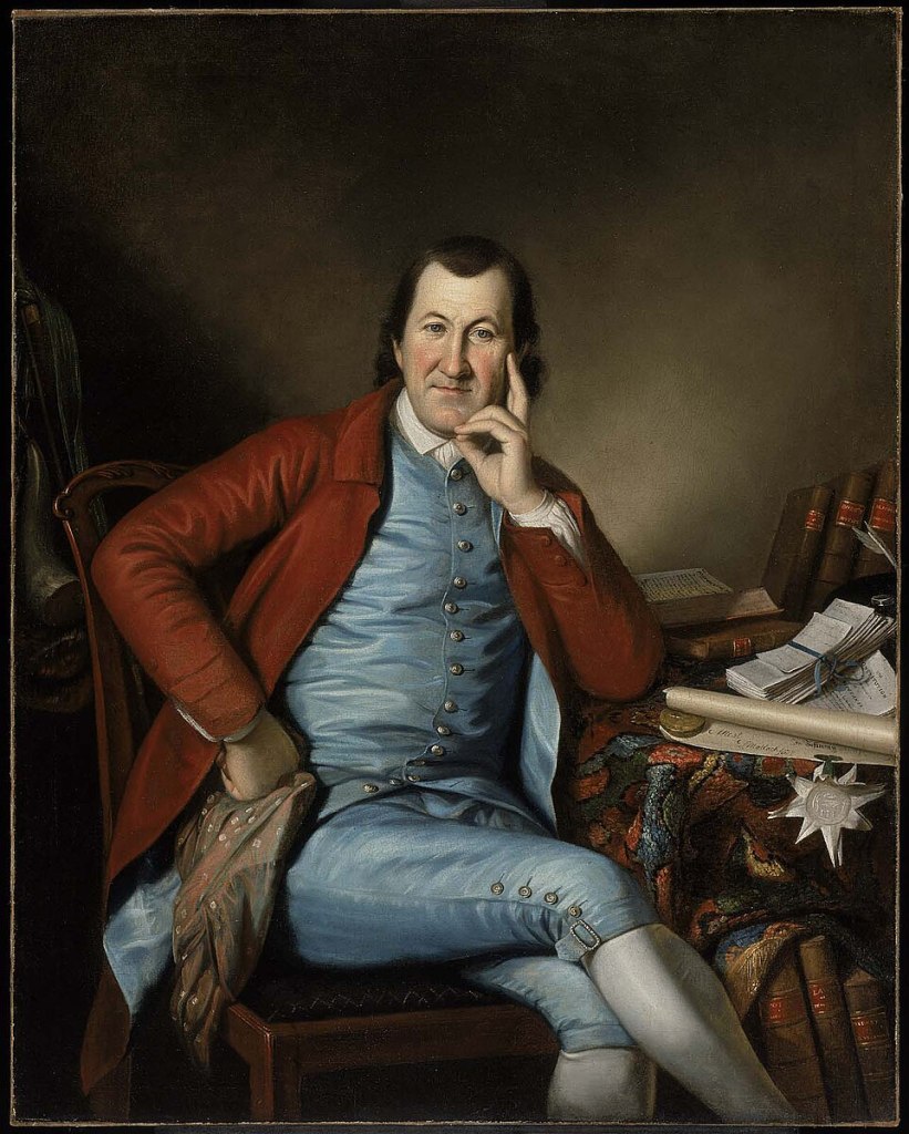
Charles Willson Peale, Public domain, via Wikimedia Commons
Rubio also proves, in a round-about-way that a font like beauty is in the eye of the beholder. Or in this case what is confusing and degrading. Now, using Rubio’s reasoning, the Biden administration switched to Calibri because the State Department thought it was easier for people with vision problems to read.
But here is the real problem with the current administration’s switch back to New Times Roman. The recommendations to shift fonts came from the Office of Diversity and Inclusion. Their decision was based on studies that Calibri was a cleaner font to read than New Times Roman.
Poor Calibri, erased by guilt from association, caught in the world of woke. Somehow the Trump State Department views Calibri as a woke font because it might be easier to read. However, readability had nothing to with Rubio’s change of fonts. Herein-lies the kicker. Anything with the Office of Diversity and Inclusion label sewed onto a government study, in this case the Calibir Font, is going to be sent to the Woke Second Hand Store found in the section of nonrenewable concepts of inclusion.
The definition of legibility is this: how easily individual characters or symbols can be distinguished from one another, how easy they are to recognize. If a font is legible, you can effortlessly distinguish between similarly shaped symbols even in small text sizes…Readability refers to the ease with which a reader can understand a written text. The definition in this context focuses on how easily the reader can scan or “glide” through lines of text without distraction or difficulty (ease of reading).—typttype.com
I personally don’t care what font the State Department uses. The State Department can hand write their correspondence using crayons from the classic 64 Crayola box. (I don’t think you would find them using “Colors of World Skin Tone” 24 color box set.) What I am getting tired of, and to paraphrase Trump’s “Russia, Russia, Russia” is “Biden, Biden, Biden” with an occasional Obama thrown in there. I would have been satisfied with we want a font with serifs and be done with it.
I think it really has more to do with purging “anything” to do with Obama and Biden. Just google Obama and Biden policies reversed by Trump. It is a long list ranging from environmental climate change initiatives dealing with clean air and greenhouse gases to fuel economy standards and federal minimum wage. Oddly we have not heard anything about the Administration’s victory over Trump’s war on water pressure. Ending this war is never included in the eight or so touted wars this Administration has ended.
But wiping out a predecessor’s legacy is nothing new. If we could travel back in time on Mr. Peabody’s Way Back Machine to Hatshepsut’s rule (c. 1479–1458 BCE) in Egypt, we would find the systematic eliminations of anything to do with her rule as pharaoh.. According to worldhstoryedu.com, “The motivations for erasing Hatshepsut’s legacy are complex and likely rooted in political, religious, and cultural considerations. First, her ascent to power was unconventional, as she took on the full role of pharaoh while a male heir, Thutmose III, was available, albeit a child at the time.”
Additionally, “Some historians have also suggested that Hatshepsut’s erasure may have been part of a broader ideological movement to purify Egyptian history. The pharaohs who followed Thutmose III, particularly during the reign of Amenhotep II, took further steps to restore a strict adherence to traditional roles and practices.”
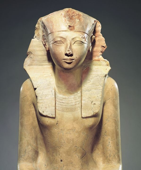
It is interesting to note that according to worldhistory.org, ‘Women in ancient Egypt were regarded as the equals of men in every aspect save that of occupation. The man was the head of the household and nation, but women ran the home and contributed to the stability of that nation as artisans, brewers, doctors, musicians, scribes, and many other jobs, sometimes even those involving authority over men.”
Hatshepsut must have really ticked off Thutmose III; her purging was done so well she was forgotten to history. Egyptians had deep beliefs about the afterlife. They believed if one’s name was removed from history this would have serious ramification in the afterlife “…it is believed that whoever removed her from public knowledge did not wish her ill after death and so preserved her name in more secluded areas.” History is out there somewhere.
It wasn’t until the 19th century that archaeologists unearthed, “in the more secluded areas” her statues, monuments and other related long lost inscriptions. It was from these discoveries that archaeologists and historians were able to determine the great impact Hatshepsut had on the development of New Kingdom’s 18th Dynasty.
History is full of purges. We can look back to October 13, 1307, a Friday when King Philip IV and Pope Clement V decided to gruesomely rid themselves, and then avail themselves of the so called fortunes of the Knights of the Templar. Ironically no fortunes were found and people have been looking for buried treasure for centuries.
As for the choice of what font the State Department uses I ask: Does anybody really care?
